Elevate Your Projects with the 10 UI Outline Icons Bundle
Why a Curated Icon Set Matters More Than Volume
In the vast world of digital assets, finding a resource that balances specificity with versatility is rare. The 10 UI Outline Icons Bundle is not just a random collection of graphics; it is a carefully curated toolkit designed to solve specific communication hurdles in user interface design. While massive libraries have their place, a focused set like this—featuring essential symbols like the Bin, Upload, and Warning icons—allows for rapid implementation without the decision fatigue often associated with browsing thousands of options. For the creative professional, time is a currency, and a well-organized bundle ensures that you spend less time searching and more time creating.
The true value of this bundle lies in its aesthetic consistency. Each line icon is crafted with a uniform stroke weight and visual language, ensuring that when you place the Bluetooth Icon next to the Receiver Icon, they look like they belong to the same family. This visual harmony is critical for establishing trust and professionalism in your designs. Whether you are building a mobile application or designing a presentation, these icons provide a clean, modern look that enhances user experience without overwhelming the content.
Breaking Down the Core Essentials
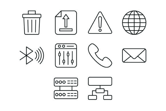
Let’s look at the specific assets included in this pack. Each of the ten icons serves a distinct functional purpose:
- Bin Icon: The universal symbol for deletion or trash. Essential for file management interfaces and content editing tools.
- Upload Icon: Vital for cloud storage applications, social media platforms, and content management systems where users need to move data upward.
- Warning Icon: A critical safety and attention marker. It is indispensable for error states, caution alerts, and terms of service acknowledgments.
- Globe Icon: Represents the internet, connectivity, or language settings. It is a staple for international businesses and web browsers.
- Bluetooth Icon: The standard for wireless connectivity, used in IoT devices, audio equipment settings, and hardware pairing interfaces.
- Mixer Icon: Often associated with audio levels, equalization, or complex settings adjustment. Great for creative software.
- Receiver Icon: Represents communication, such as a telephone handset or audio output. Useful for call centers, VoIP apps, and support pages.
- Message Icon: The cornerstone of chat applications, contact forms, and notification systems.
- Server Icon: Represents backend data, hosting, or IT infrastructure. Essential for B2B software dashboards and tech blogs.
- Hierarchical Structure Icon: Visualizes organization, management, or data flow. Perfect for project management tools and corporate presentations.
This combination covers the "heavy lifting" of most digital interactions. You have the tools to manage data (Server, Bin), handle communication (Message, Receiver, Globe), and adjust settings (Mixer, Bluetooth), all wrapped in a consistent outline style.
For UI/UX Designers and App Developers
If you are designing a mobile app, consistency is your north star. The 10 UI Outline Icons Bundle comes in SVG format, which is the gold standard for responsive design. SVGs scale infinitely without losing quality, meaning your Upload Icon will look crisp on a small smartphone screen and equally sharp on a 4K desktop monitor. You can easily change the color of these icons via CSS to match your brand’s color palette or to indicate different states (e.g., turning the Warning Icon red when an error occurs).
Consider a project management application. You can use the Hierarchical Structure Icon for the "Teams" section, the Globe Icon for "Global Settings," and the Server Icon for "Data Usage." Because the lines are clean and uncluttered, they integrate seamlessly into minimalist dashboards where screen real estate is premium.
For Marketers and Bloggers
Visual hierarchy is just as important in a blog post or a newsletter as it is in an app. Text-heavy content can be daunting for readers. By integrating these icons, you can break up the text and highlight key takeaways. For instance, if you are writing a tutorial on how to clear cache, the Bin Icon serves as a perfect visual anchor for that section. If you are discussing digital connectivity or globalization, the Globe Icon adds immediate context.
These icons are also excellent for creating custom graphics for social media. Use the Message Icon to create a "Join the Conversation" graphic, or use the Warning Icon to create a "Stop Doing This" post. The JPG and PNG formats included in the zip file allow for quick drag-and-drop usage in tools like Canva or Adobe Express.
For Print and Presentation
The utility of this bundle extends beyond the screen. In corporate environments, presentations often suffer from generic clipart. The vector formats (AI and EPS) included in this bundle allow you to resize the icons for large-format printing or detailed slide decks without any pixelation. Use the Receiver Icon on a business card for the phone number section, or use the Bluetooth Icon in a product manual for a hardware device. The outline style ensures they look professional and serious, avoiding the cartoonish look of some stock assets.
Technical Flexibility and File Formats
One of the standout features of this bundle is the inclusion of 5 different formats. This versatility ensures that you are never blocked by software limitations:
- AI (Adobe Illustrator): The master vector file. Use this to edit the anchor points, change stroke weights, or combine icons to create new custom illustrations.
- EPS: A widely compatible vector format that works with CorelDRAW, Affinity Designer, and older versions of Illustrator.
- SVG: The web standard. These are lightweight, scalable, and perfect for coding into websites.
- JPG: Best for use in word processors or environments where transparency isn't supported.
- PNG (Transparent Background): Essential for layering icons over images or colored backgrounds in web design and video editing.
This multi-format approach means the 10 UI Outline Icons Bundle is truly "ready to use for all devices and platforms." You don't need to be a conversion expert to start using them immediately.
Tips for Maintaining Consistency and Usability
When using outline icons, there are a few best practices to ensure your design remains effective:
1. Mind the Padding: Outline icons often require slightly more padding than solid icons to prevent them from looking crowded. Give your Server Icon room to breathe within a button or a list item.
2. Color Contrast: Since these are line icons, the visual weight is lighter than solid fills. Ensure you are using a high-contrast color against your background. A light grey outline on a white background might look elegant, but it could fail accessibility standards. Use a darker shade for better visibility.
3. Contextual Clarity: While the icons are distinct, always consider pairing them with text labels for critical actions. The Mixer Icon might be intuitive for an audio engineer, but for a general user, the word "Settings" next to it provides necessary clarity.
By following these guidelines, you ensure that the icons serve their primary purpose: improving the user experience through clear, visual communication.
A Smart Asset for the Modern Creator
Ultimately, the 10 UI Outline Icons Bundle is about efficiency and clarity. It strips away the noise and provides you with the essential building blocks of digital communication. Whether you are a freelancer polishing a client deliverable, a startup founder bootstrapping your first app, or a teacher creating educational materials, these icons offer a reliable, professional foundation. They are designed for maximum usability, ensuring that your message is understood instantly, regardless of the device or platform your audience is using.
We hope you like our icons and find creative, practical ways to integrate them into your workflow. Sometimes, the simplest tools are the ones that make the biggest difference in the final polish of a project.
